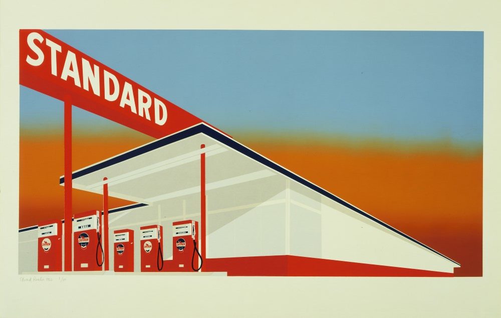
The American Dream: pop to the present begins with the explosion of pop art in the 1960s and includes works by the most celebrated American artists from Andy Warhol, Jasper Johns and Robert Rauschenberg to Ed Ruscha, Kara Walker and Julie Mehretu, who all experimented with printmaking taking inspiration from the world around them.
As well as concentrating on the print works created by these artists, the exhibition reveals their relationship with the printmaking workshops and the development of their skills over time.
Why did you choose the American Dream as the topic for a major exhibition at the British Museum?
The focus of this exhibition are the prints made by American artists from the early 1960s to the present – 70 per cent of the works in the exhibition come from the British Museum’s collection. Ten years ago we couldn’t have produced this show because we didn’t have the material to justify doing so.
The exhibition came about because in 2008 I produced an exhibition called: American Scene: Prints from Hopper to Pollock, which examined print in America from the early 1900s Ashcan School, with John Sloan and others, up to Jackson Pollock and the abstract expressionists of the 1950s.
So this exhibition takes the story forward with the advent of Andy Warhol and the pop artists, through to the work of the minimalists and the photorealists but it also looks at the whole explosion of print making in America that took place in the ’60 and ‘70s thanks to the establishment of state-of-the-art print shops. These print shops enabled this explosion of print to be possible as artists were really encouraged, both on the east and west coast as well as elsewhere, to create things not seen or done before in terms of scale, size and materials.

What is the main focus of the exhibition?
We wanted to foreground the print. Print is too often marginalised. Exhibitions are usually devoted to a single artist or to a movement but vary rarely include their working in printmaking.
It’s almost as if it’s seen as an also ran – they are very much in the shadows painting and sculpture or installation art and so forth. But in fact Pop Art couldn’t take place without the print – it was their means of actually getting that work out to a much wider audience. The minimalists used printmaking as a way of working through their ideas in serial form – it was an absolute gift to them.
Who have you worked on with the design of the exhibition?
We have worked very closely the designer Nissen Richards and from the very beginning of the planning of the layout it was a question of creating the spaces in which we could show these works in the most instructive and eloquent way.
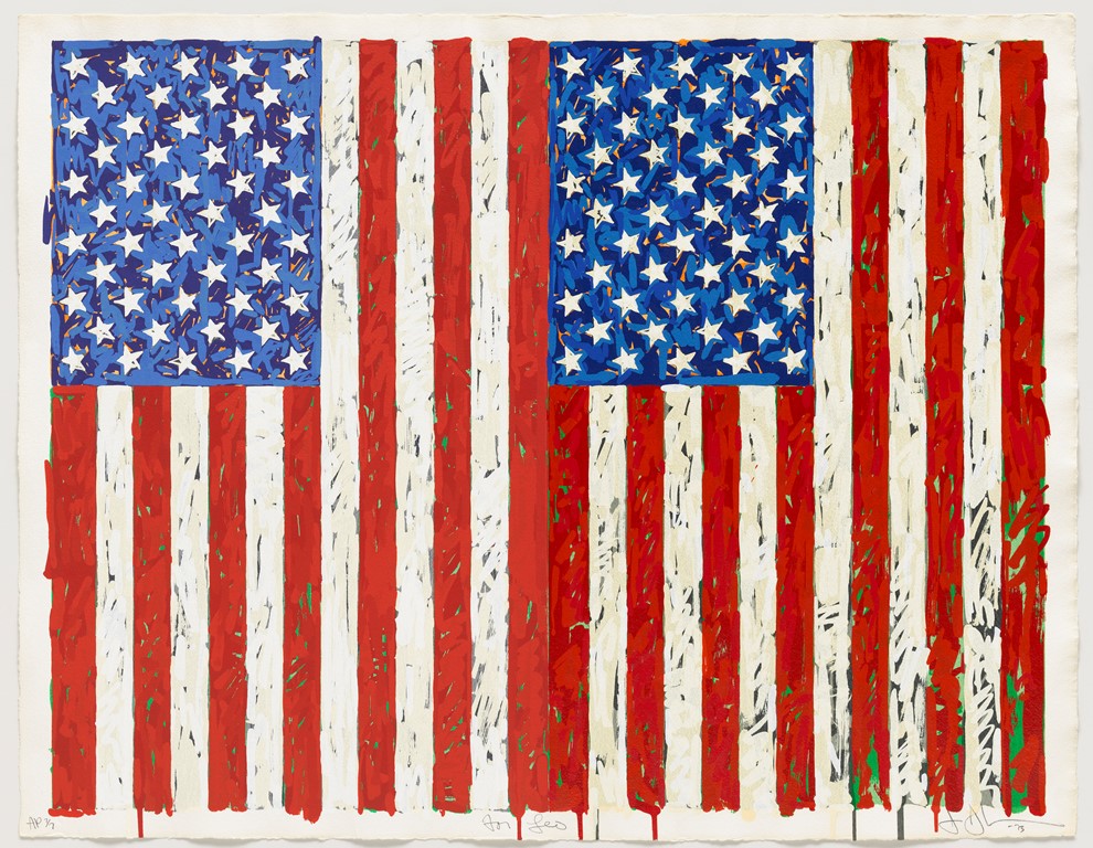
So what we have done with the designers is divide this huge space in the British Museum’s Sainsbury’s Exhibition gallery into 12 discreet rooms. But they are not 12 white cubes, each room has its own character, each room is in its own colour: the first room dedicated to Pop Art is in red, the following room dedicated to three giants of the American printmaking Jasper Johns, Robert Rauschenberg and Jim Dine is in blue. And with the design of the exhibition we can look forward as to what is going to come, so there is a sense of anticipation, but also with various cut-aways we can look back on what we have seen before, so there is this wonderful sense of looking forward and looking back as you go through this exhibition.
How have you made the subject come to life through the exhibition’s interpretation and design?
We have interspersed the exhibition with objects paintings and sculpture which show the crossover of these artists’ ideas in different media. Although print is foregrounded and is the primary focus of the exhibition we will also show a sculpture or a neon by Bruce Nauman alongside a print made in that same year.
A focus of the exhibition is that these prints were made in workshops, which relied on the collaboration between the artists and the highly skilled printers to realise the artists vision and we have footage of the artists at work. Whether it’s Richard Diebenkorn scratching away at a copper plate with a metal tool or Andy Warhol on all fours dragging a squeegee across a screen in order to create one of his electric chairs.
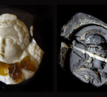
You have to remember that in the ‘60s there was an incredible optimism and can-do attitude which still continues today in America and artists were invited to these workshops to make all sorts of prints, which were very unusual. They were using unusual materials and we show Robert Ruaschenberg making his Carve Bird Door or his Carve Birds, which look like they are made out of cardboard but everything is printed as a facsimile, so they looked like assemblages. Or you might find Ed Ruscha who instead of using conventional inks goes into a supermarket and buys various ingredients to see whether for example baked beans or caviar would make a suitable material in which to print. The results he called organic screen prints.
What partnerships have been made through loans and have any objects in the British Museum’s collection been used?
Some of the key loans for the exhibition have come from prestigious institutions in the US such as MoMA, National Gallery of Art in Washington DC, both of whom have been very generous lenders to this exhibition, and similarly we have also borrowed from the Tate, V&A and from the Warwick Art Collection at the University of Warwick. As well as a number of private collectors in the US the UK and from the continent. There are then the bulk of works, which have been acquired very recently in the past few years for the British Museum’s collection, as recently in fact as last year.
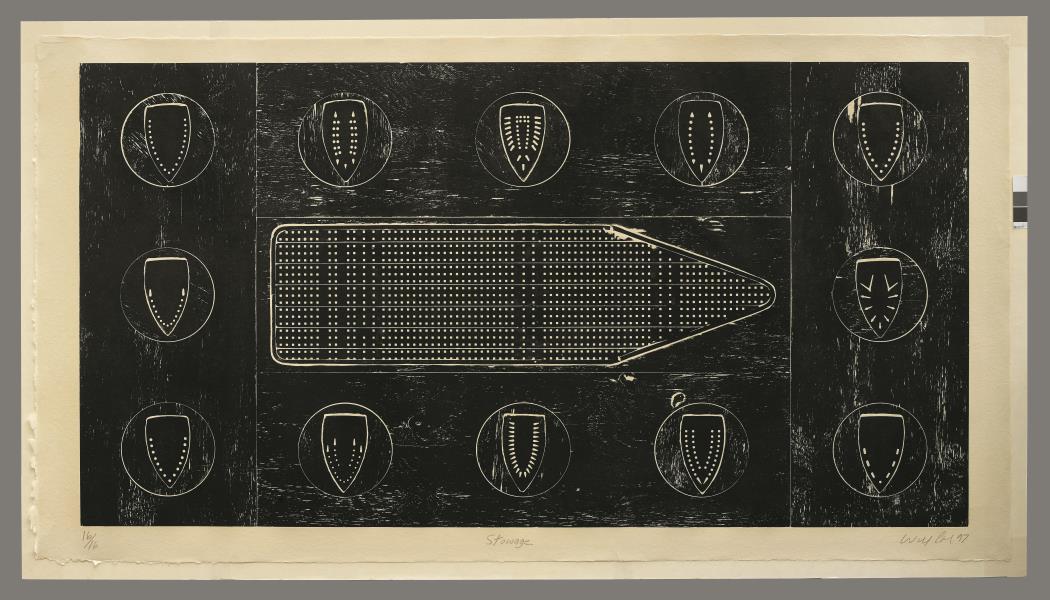
There is an amazing work by Willy Cole, a print called Stowage (main image), which is some 9ft across and 4ft high and printed as a wood block but using the ironing board as one of the surfaces, which he has printed to create this work that references the very famous diagrams of the slave ships. He finds a parallel between the perforations on the metal ironing board to the ship.
What are the aims and objectives of blockbuster exhibitions to the British Museum and what benefits do they have for the museum and visitor?
An exhibition such as this one can present material to an audience which it is unfamiliar with. In this case it is the print being a major part of an artists’ work. The advantage of creating an exhibition on this scale is that you can follow through over a period, which we do, of 50 to 60 years. Just how the print has been used by artists both as a vehicle of disseminating their style and as a way for them to explore notions of seriality in particular to the minimalists and also to address social and political issues as the print exists in more than one form. Artists are attracted by the idea that these works can be easily published and people with a modest income can afford them when they come out.
Above all the exhibition is an opportunity for the younger generation in particular, as this maybe their very first encounter with print and with these artists’ work in printmaking and may indeed register with them for years to come.
What will the legacy of the exhibition?
The legacy of the exhibition will be the sheer creativity, diversity and versatility of these artists and how extraordinary these works are. The exhibition will show how America is a place of great energy and the works reflect so much of what we understand about the country. They address issues that are with us today such as race and identity issues of patriarchy in the case of the women artists.
What challenges have been faced during the planning and implementation of the exhibition and how have these been overcome?
The first challenge was the size of the gallery [1,100 sq m], a huge hangar-like space, a vast room that could probably fit a jumbo in it. The challenge was how do you make that space work to the best advantage of the material you’ve got? How do you make it work so the visitor won’t be fatigued within three or four rooms of the exhibition? We had to make it visually compelling and interesting as possible without overloading the visitor and without bombarding them with too much stimuli or distracting material. I think we really have achieved that.
How does this exhibition fit in with the British Museum’s programme?
The museum has always been interested in the contemporary. Sir Hans Sloane collected, for example, prints by William Hogarth his contemporary and so we at the museum have created a series of exhibition devoted to the 20th Century based on the museum’s collection of print and drawings, so it’s very much part of the programme of what we do here.
The American Dream: pop to the present runs until June 18. There is a wide-ranging programme of events, starting this Friday 17 March with a talk by Simon Schama, includes activities for both adults and children.
Main Image:
Willie Cole (b. 1955), Stowage. Woodcut on Japanese paper, 1997. © Willie Cole. Reproduced by permission of the artist courtesy of Alexander and Bonin Publishing, New York