
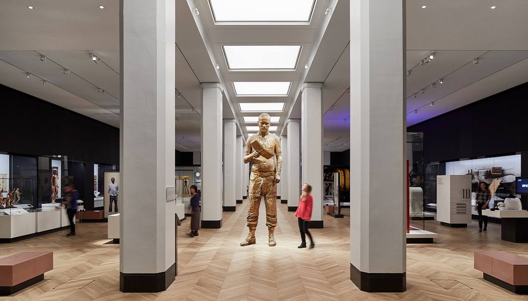
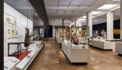
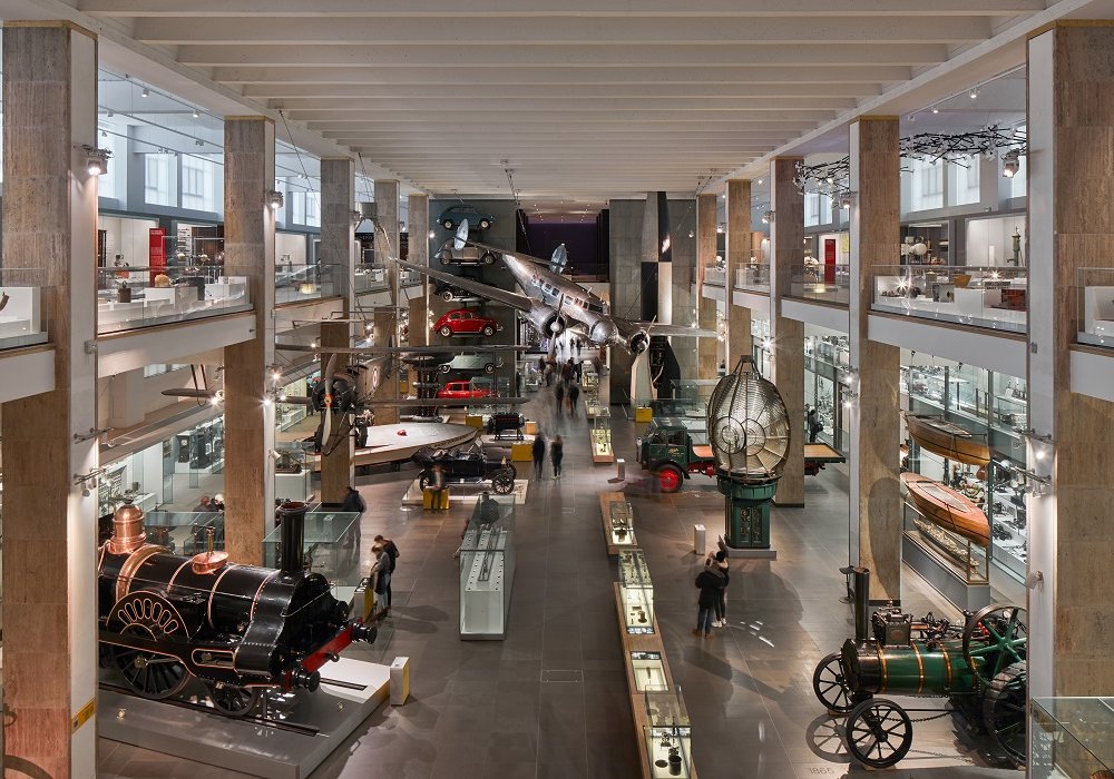
One of the largest and most talked about projects of 2019, the transformation of Science Museum’s first floor into the world’s largest medicine galleries serves as a perfect barometer for design and fit-out in the sector.
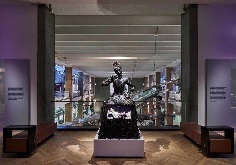
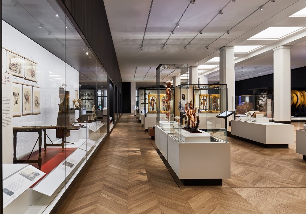
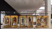
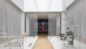
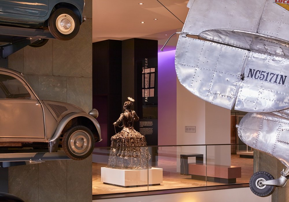
Medicine: The Wellcome Galleries was a £24 million scheme designed by architects WilkinsonEyre, a long-time collaborator of the Science Museum. The work almost doubled the first floor’s permanent display space to 3,000m² and signifies the “culmination of a decade of extraordinary architectural transformation”, according to Science Museum Group’s director of masterplan and estate, Karen Livingstone.
Phase I of the Museum’s Masterplan, which was completed when the Wellcome Galleries opened its doors, has seen over 15,500m² of renovated public spaces opened in the Science Museum since its inception.
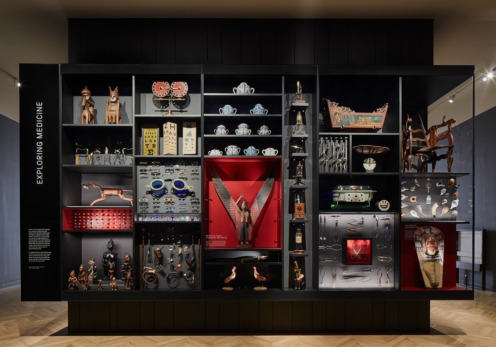
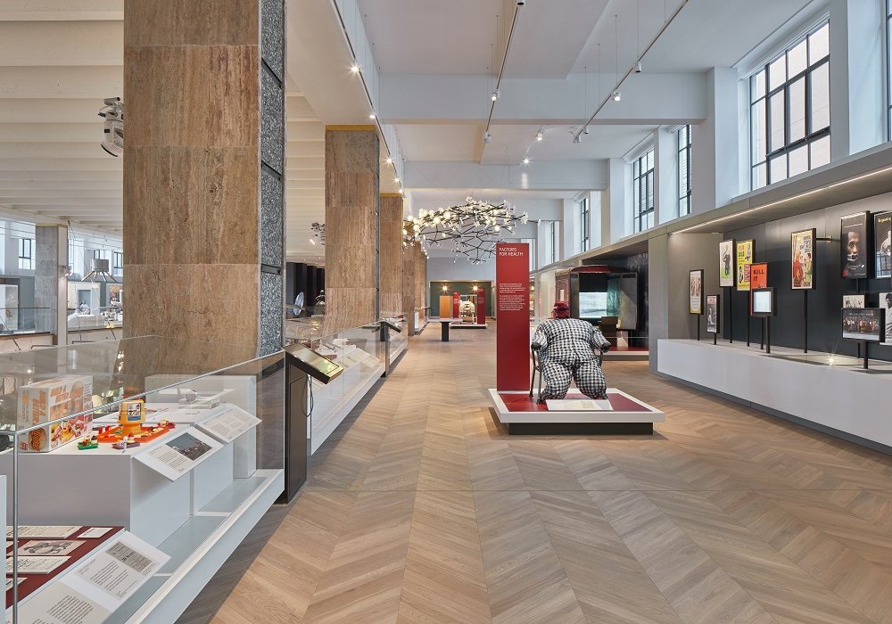
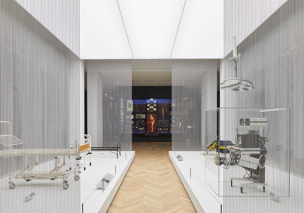
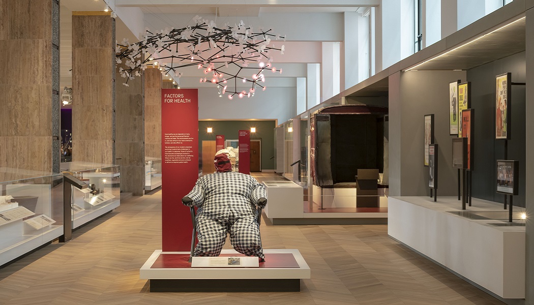
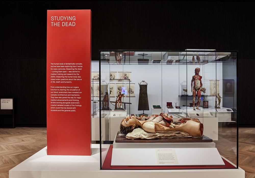
WilkinsonEyre’s newest designs take visitors through the Galleries’ five distinct themes: Medicine & Bodies; Exploring Medicine; Medicine and Communities; Medicine and Treatments and Faith; and Hope and Fear.


Discussing some of the profound difficulties of a project at this scale, Julia Glynn-Smith, associate director at WilkinsonEyre, told Advisor: “Cataloguing, conserving and measuring the objects, that is probably the main reason the project took as long as it did.”
The lack of uniformity throughout the disparate spaces meant everything had to be taken back to the bare bones before a continuous aesthetic could be implemented. “Crafting a coherent visitor journey through what had been three very separate building styles was one of the larger tests. We combatted this by using the same materiality throughout.
“It also overlooks the atrium of Making the Modern World, so we had to consider how best to tie it in with that. Doing all this while working within an operational building obviously brought its own challenges as well.”
One of the specific physical challenges was presented by the Museum’s imposing central lifts. “At one stage we were trying to remove the lifts to create a visual draw through the whole space, but the Museum needed to keep them in place so we decided to wrap them in display cases. This meant many items that didn’t necessarily fit the narrative of the main spaces could be taken out of the Blythe House stores and enjoyed by visitors,” she added.
This was such a success, Glynn-Smith told us, that the Museum has now decided to implement this approach on other levels at the site.
Intelligent interpretation
We speak to Holmes Wood about their brief to design interpretation fit for a gallery of the future.
Everything needs a point of difference...there are so many things out there for people to visit, you have to have something different to attract your visitors and keep them coming back again and again.
Interpreting The Wellcome Galleries: Q&A with Holmes Wood
The Wellcome Galleries’ 3,000m² exhibition spaces can be accessed from a wide range of points, making the brief to deliver a sensical visitor journey yet more complex for the designers.
“We had to really understand and deliver a non-linear narrative for visitors,” Glynn-Smith notes. “On top of this, the Science Museum has a hugely diverse range of visitors. Trying to create spaces that would engage all of these groups was a major consideration.
“Dwell time is another huge disparity between visitors. Some will be cramming three South Kensington museum visits into one afternoon, whereas others will be at the Science Museum for the whole day.
“Understanding that, which we achieved by shadowing visitors to observe how they found their way around the Museum and engaged with certain displays, made the whole project a really interesting exercise.”
WilkinsonEyre was involved on the project for seven years in total, with the brief to deliver a design that would be in place for a quarter of a century. This design for longevity was key to what the Museum wanted, the architecture practice’s associate director explained. “It’s probably the first time we’ve come across that in a brief. It meant we really had to think about how to design something that would deliver a consistent level of quality and functionality for that length of time.”
A sea of possibility
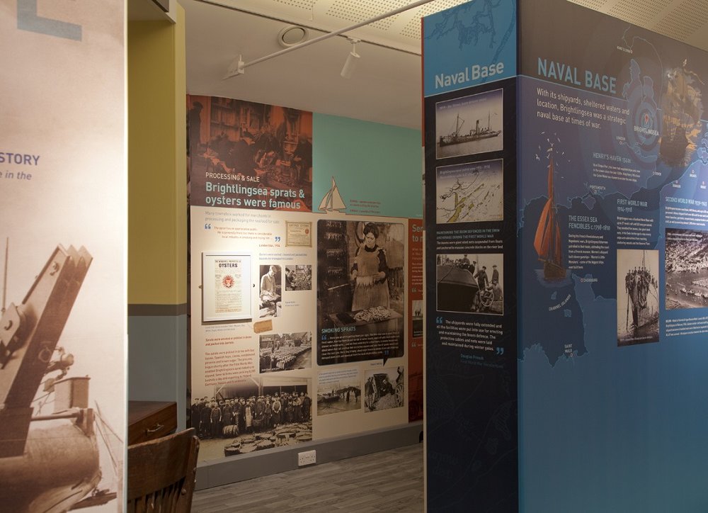
A long way from the Science Museum in pretty much every way imaginable, Brightlingsea Museum is situated in a coastal town near the border between Essex and Suffolk.
Bequeathed to the Museum’s current team after its founder passed away, the site charges no admission to visitors and so relies solely on donations. Its move to a former police station and the subsequent five-year, £750,000 community renovation has been part-funded by National Lottery Heritage Fund support.
Now equipped with a combined reception and exhibition space of around 125m² – which has approximately doubled its previous footprint – the local museum’s refit is in a very different category to the Wellcome Galleries, but was no less of a herculean task for those involved.
The design and interpretation for the Museum’s new home was led by illustration specialists Maltings, a two-person team based in Derbyshire. Having worked on projects for Historic England, Historic Scotland and the National Trust, Maltings is hardly new to the sector, but Brightlingsea did throw up plenty of new experiences.
“We’ve done a lot of interpretation work over the years for heritage centres, churches, castles, but never a museum,” explains company co-founder Mike Foster. “With this in mind we were really keen to create something that was a little bit different and unusual. Our whole pitch revolved around that and the museum team really bought into it.”


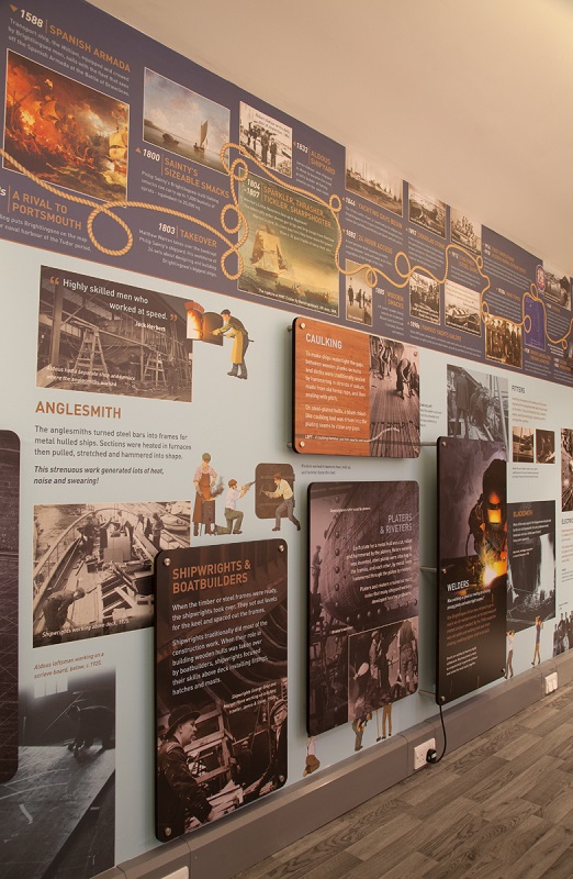


Throughout a process which heavily involved input from the Museum’s team of dedicated volunteers, the goal was, Foster notes, to create a space “not only good for visitors to the area, but also an exciting place in the local community that has room to grow and change”.
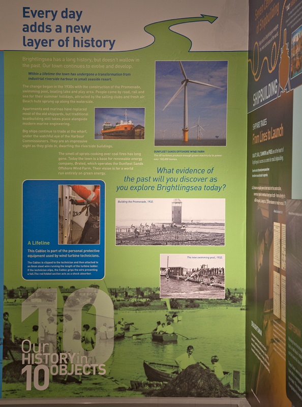
The new site was never going to conform to stereotypes of a local museum. At its old site the Museum had grown very much ‘organically’, according to Foster. “It was very typical of many other museums of a similar time and size: lots of large panels with disparate design containing vast amounts of information.”
Moving away from this, the designers hoped to develop a space which could deliver stories in a slightly different way. “Lots of local museums have a thing where you come through the reception area, you enter the museum and everything is directly in front of you on display. It’s very much a scattergun approach.”
This was never the plan for the redeveloped Brightlingsea Museum. To avoid this, a lot of time was spent pinpointing an optimised visitor journey. “Determining the emotional experience of visitors and defining the dwell points were key considerations when making layout plans. Not all of it should bombard visitors immediately, we want experiences spread out through what we call ‘story zones’.”
This approach, Foster says, allows the Museum to “change the tempo”; meaning transitions are managed between spaces that are fun, interesting or interactive into a more subdued or sad area. “It’s more like the linear nature of a film or documentary than many small museums where it’s all left up to you as the visitor to decide what’s happening,” he adds.
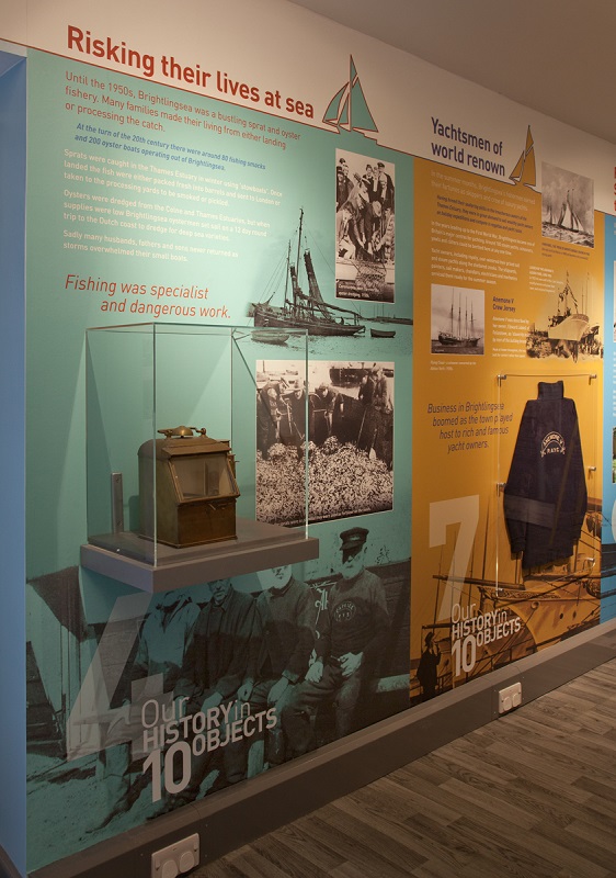
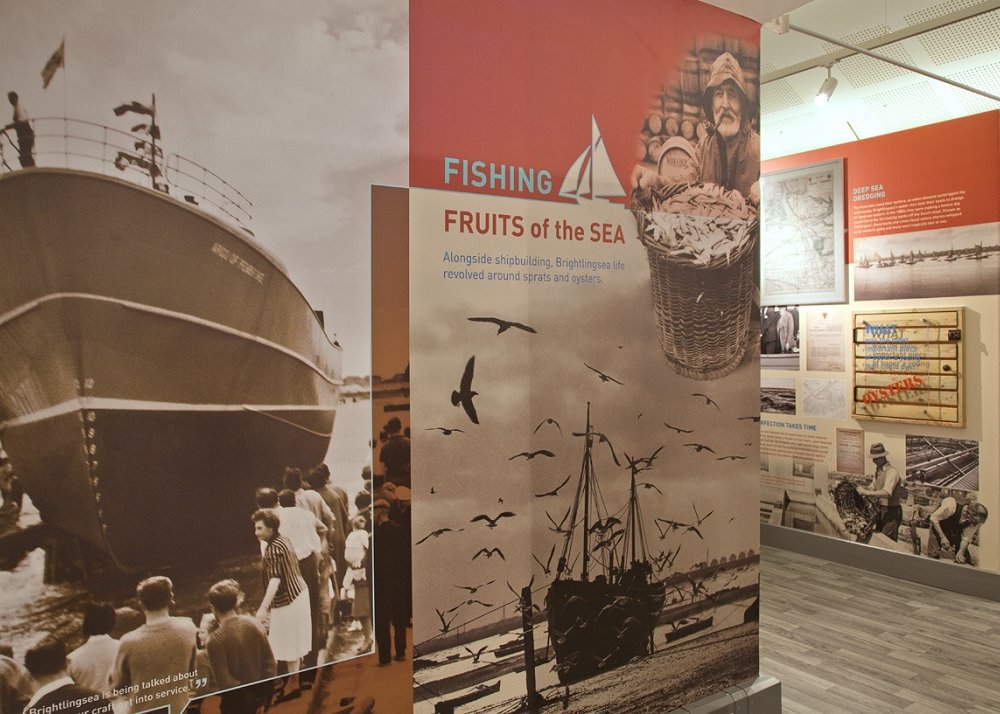
Context was also paramount in the brief, with coastal and naval themes never far from discussions. This was, however, never at the cost of functionality.
“We’ve made certain spaces mimic the themes and content they explore. In a zone which echoes a ship’s cabin, for instance, we made the room very tight and confined so people get a sense of how people working on ships would have felt – while also maintaining wheelchair access throughout so every visitor can experience each section of the journey.”
Flexibility was another of the scheme’s watchwords. “The reception area embodies the flexibility we’ve incorporated throughout the scheme,” Foster proudly asserts. “The retail unit, for example, contains a beach hut which can be wheeled out onto the sea front during high season to attract visitors. All the elements designed like this can be manoeuvred and changed to perform multiple purposes in a variety of places.”
The only regret Foster cites is that the lighting scheme had been agreed upon before Maltings was on board. “We would, ideally, have liked a greater degree of controllability to be offered on that front. That said, the scheme we’ve got might leave us a little opportunity to tinker with that and try to optimise what it can do.”
Light and shade
Concord by Sylvania UK discusses the careful considerations cultural attractions should take when selecting lighting solutions.
An important requirement unique to this sector is flexibility to completely change the position and style of lighting from one collection to another.
The parallels and differences of the two projects are plain to see. Many of the key focuses for museum clients – flexibility, accessibility, visitor experience, longevity – remain the same regardless of size, but with greater budgets come a double-edged sword of opportunity and risk.
Regardless of their scale, both schemes have transformed a previously outdated or redundant area into a space that will attract new audiences and safeguard their short-, medium- and long-term futures.