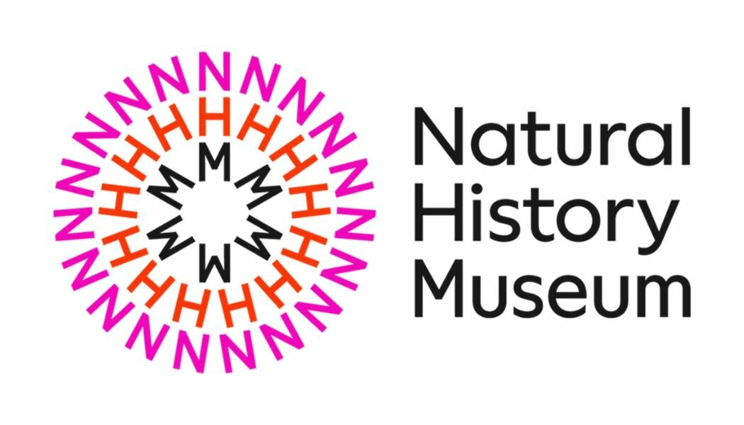
The Natural History Museum has begun the roll out of a new look, with a newly developed logo, colour palette and brand assets as the museum approaches its 150th birthday.
The new look, which replaces a logo introduced in 2017, is currently being rolled out in parts of the museum’s website and social media presence, and includes a new circular logo and bright colours palette.
Agencies Pentagram and Nomad worked with the museum’s in-house team on a brand strategy developed by agency Heavenly.
The logo has been designed to unite the Museum’s sites, South Kensington, Tring and the new scientific facility which will be located at the University of Reading’s Thames Valley Science Park.
The Museum’s Head of Marketing Richard Orr and Head of Public Space Programme Lucy Clark spearheaded the work.
Orr said: “With a bolder and more contemporary voice the new brand positioning can better engage both existing and new audiences and help us highlight how the Museum is finding solutions to the urgent issues that face our planet.”
Clark said: “With dynamism and motion at its heart, our new brand reflects the catalytic power of our collections, world-leading scientific expertise and enormous audience reach.”
The circular, text-based logo has been designed to work as a motion graphic, and examples of the logo in action include a ‘filter’ for smartphone cameras which sees the logo appear from users’ mouth.
Pentagram said the museum “needed a symbol that made reference to our planet and the universal connection between everything in nature.
It continued: “…the Museum has to reassert its position as a leading scientific voice in the discussions on the future of our planet and climate emergency.
“In this new phase the Museum needs an identity to activate engagement with both existing and new audiences in everything that it does. From research to entertainment, education and activism.”

