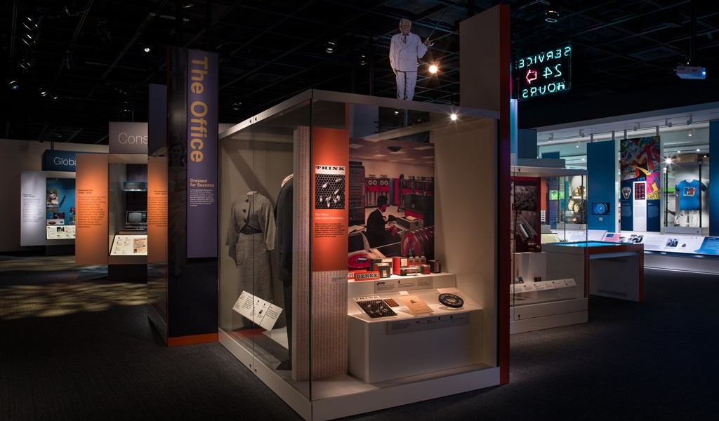
For an exhibition such as American Enterprise, which opened a year ago and is intended to last and remain fresh for 20 years information and objects were critical components of the exhibition design strategy. Along with changes in information-delivery technology and coupled with in excess of four million visitors to the museum each year, thoroughness of design, robustness of execution, and above all maintainability were essential.
The major objective was to mount an exhibition on business history at the museum, something that had not been done before at the museum and had seldom been attempted elsewhere. The big message of the exhibition is that American business practices had commonality over time and is in a state of constant change. “The means used to illustrate this focused on personalising a national story,” said Stevan Fisher, a Senior Designer, at National Museum of American History.”
Four economic eras were selected: Merchant, Manufacturing, Consumer & Global—spanning colonial to modern times, each dealing with four main issues: Innovation, Competition, Opportunity and the Common Good. These were flanked, intellectually and physically, with a timeline of business advertising and a timeline of business innovators. “Effort was put in to providing enough physical and intellectual interaction to engage with the ideas and objects on display, and the designers successfully met those goals, as shown by the popularity of the exhibition and our audience’s engagement with it,” says Fisher.
Another key factor was budgeting, which Fisher says goes far beyond the initial installation. “Good and thoughtful design, planned maintenance and support (for both hardware and objects), affiliated public programmes, social media and web presence, as well as upgrades and updates come into play with long-term exhibitions, and all need dedicated funding and/or ongoing fund raising. Proper budgets reflect these realities,” he says.
During the design process Fisher says the museum does both formal and informal review and testing of the messages, general ideas, and even specific interactive treatments with the general audience on the museum floor. These tests are facilitated with museum staff from the education and public programmes, technical support staff, volunteers, curators, and contractors. “Also, our editor works with the curators and outside reviewers to make sure that the proper language is used to meet the target audience (American Enterprise was written to the 10th-grade level), and sample text and labels are prepared to test legibility and accessibility,” says Fisher. “Technological and production developments over the last decade have lead to systems for content delivery that both augment and expand on traditional methods of getting ideas across to our visitors.”
Some of the advances in museum design Fisher mentions that were employed in American Enterprise were; the use of LED lamps and fixtures, which improve the life-cycle and infrastructure costs; advances in fiber-optics and development of low-voltage LED panels for labels, which have improved the museum’s ability to effectively and safely display even very sensitive objects; large-format digital graphics that have expanded the palette available for incorporating images; multi-panel and interactive video delivery; the use of low-reflectance glass, which has allowed a more intimate interaction with the objects, and creating spaces that break up flat surfaces and using integrated object bracketing as well as compact soundscapes to broaden the sensory experience.
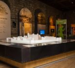
Behind the design of the exhibition was Haley Sharpe Design (hsd) with an original brief to design a major new gallery exploring the history of business via innovation and enterprise in modern America. This 8,000 sq ft gallery focuses on business and innovation from the mid-1700s to the present. It traces the country’s development from a small, dependent agricultural nation to one of the world’s most vibrant economies and contains more than 600 artefacts, an advertising wall and capsule biographies of inventors, innovators and entrepreneurs.
“An important aspect of the brief was to develop multimedia and theatrical presentations of the content narratives and collections to engage a younger ‘teenage’ audience,” says hsd Director and lead designer on the project Jan Faulkner. “We also supported the museum with the production of visuals for fundraising and architectural liaison for the renovation of all the transitional and circulation spaces within that wing of the museum.”
On a practical level, says Faulkner, the collections were drawn from an array of material types and therefore had very varied display criteria. Many of these were light sensitive, which demanded careful consideration and specification of display case solutions, to manage environmental and security controls whilst maximising the visual and narrative impact for visitors. “So, our creative approach involved bringing the varied and eclectic collections alive through a mixed palate of media, and connecting them to a modern audience through engaging storytelling techniques in a cohesive and intuitive way that provided clear messages within an immersive and engaging environment,” says Faulkner.
To do this hsd collaborated with the curators to develop a narrative thread that weaves, through the collections to illustrate insightful and engaging themes within each of the gallery zones where they had to creatively display the more than 600 historic artefacts. “Given the volume of content material, we structured the communication hierarchy approach as simply as possible; separating each story without fracturing the overarching thematic structure of Opportunity, Innovation, Competition and Common Good.”
When it comes to exhibition design in the US more emphasis has been put on accessible, or universal design, for longer says Faulkner. Whereas in the UK there is a greater emphasis on integrating activity planning (programming) with exhibition design. “Overall the core tasks and outcomes are broadly similar,” he says. “Museum design is both an art and a science, and requires a whole array of factors to be systematically considered. Our main consideration is always creating the most appropriate and impactful experience for visitors through the creative display of collections. But other considerations include integration with architectural spaces, robustness and durability of media, social and learning outcomes, sustainable display infrastructure, and value for money.” Good exhibition design, says Faulkner, clearly communicates a subject or idea to audiences. Today he says audiences expect a seamless integration of digital media across all platforms – so projects succeed when this is achieved and also stand the test of time.
hsd sought to create an immersive and compelling exhibition environment. Examples of this include:
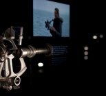
- The reactive AV wall at the entrance encourages visitors to explore key words/concepts. The AV programme not only delivers the key messages in a non-linear and engaging way but also allows for the digital unpacking of the main narrative’s and the interpretive threads as an digital introduction the to gallery.
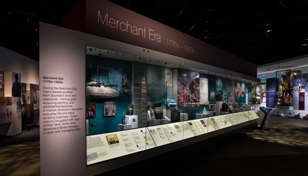
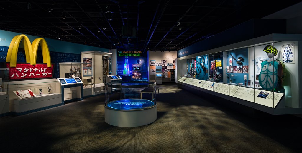
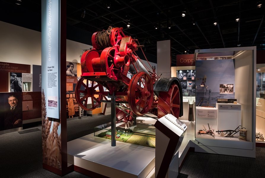
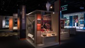
- Artefacts are at the heart of this exhibition, some of which have never been on display before. Visitors are taken on a journey through four periods spanning the story of America from the 1770s to today: the Merchant Era, the Corporate Era, the Consumer Era, and the Global Era. To define each era a 30-foot display case holds the main narrative; this is broken up into subthemes by the collections.
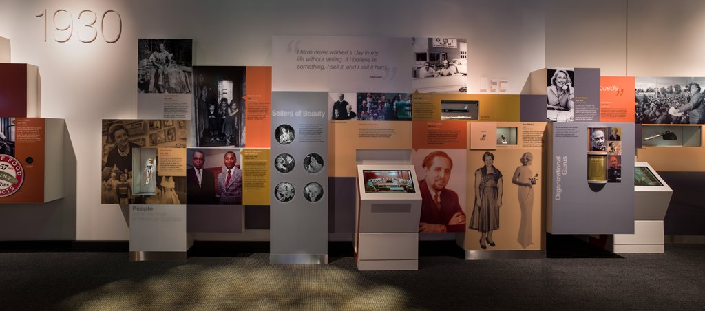
- The exhibition’s exploration of the Merchant, Corporate, Consumer, and Global eras of business history feature stories on advertising history and a biography wall with capsule histories of inventors, entrepreneurs, marketers, regulators, and others who transformed American life. American Enterprise concludes in the “Exchange” where hands-on activities allow visitors to manage a farm, run a cat food business, resolve tough ethical dilemmas, and scale the tower of business success through cooperation or competition.
- hsd’s creative approach involved bringing the varied and eclectic collections alive and connecting them to a modern audience. We also had to creatively display over 600 historic artefacts; many with varied display criteria and many light sensitive. This demanded careful consideration and the creation of sophisticated design solutions in both display case specifications and adjacency of artefacts.
- Our creative design solutions included keeping the communication hierarchy as simple as possible, and separating each story without fracturing the overarching thematic structure of opportunity, innovation, competition and common good.
- To make the exhibition relevant we have given visitors the opportunity to understand the ‘character’ of America today and how it became this way; encouraging visitors to look at the past and contemplate what the future holds.

